
Toyota Reimagine: Elevating Hundreds of Toyota Australia Pages with a More Cohesive and Contemporary Experience
Toyota Reimagine is a large-scale initiative to modernize and unify Toyota Australia’s digital presence. The project involved uplifting the design and migrating content across hundreds of pages to create a more cohesive and contemporary experience.
Through refreshed UI, refined interactions, and consistent design patterns, the new experience enhances usability and visual alignment across platforms. This transformation strengthens Toyota’s brand presence while improving the overall customer journey online.

Disclaimer: This is a high-level project overview. For the full case study or more details, feel free to reach out at olehabib98@gmail.com.
Key Challenges
- 01
How to migrate and redesign hundreds of pages efficiently while maintaining visual and functional consistency?
- 02
How to balance design intent with the limitations of Sitecore components and technical constraints?
- 03
How to maintain quality control and ensure consistent standards across multiple teams and roles?
- 04
How to manage client feedback and revisions while keeping timelines on track?
Design Process
- 01Prepare build guide and assets for Content Manager
- 02Create example design for shift & lift category
- 03Create new design for redesign category
- 04Align design with component system
- 05Content Manager build pages in Sitecore
- 06Designer create new design proposal if client have a feedback on the build
- 07Design consult on component and layout usage
- 08Designer review desktop and mobile builds
- 09Content Manager revise builds
- 10Finalize migration and publish
Key strategy
Enable a workflow that balances speed, consistency, and quality. By providing clear design examples, guidelines, and component rules, we ensure that design and content work in harmony, keeping delivery efficient and visually consistent.
Key Solutions
- 01
Two-track approach
Shift & Uplift: Updated visuals using the new design system and components.
Redesign: Reworked information architecture and layouts for key pages, with approval from Product Owners. - 02
Component-based scalability
Collaborated closely with dev to identify component gaps early, request new builds, or adjust timelines to avoid production delays.
- 03
Pattern-based design documentation
Created build guides and example pages as visual references for Content Managers. This approach established clear design patterns, so they could build pages consistently without needing separate designs for every case. Designers then focused on reviewing and refining the final builds.
- 04
Cross-team collaboration
Content Managers build pages based on the example pages, guidelines, and components provided. They collaborate with Designers to confirm the best layout, typography, colors, and components for each page.
When a component doesn’t work as intended or doesn’t follow design best practices, Designers coordinate with Producers and Developers to fix bugs, refine interactions, and ensure page releases align with client expectations. - 05
Iterative refinement
Conducted multiple review loops between designers and developers. Designers reviewed each page and provided clear feedback, direction, and component-level details, covering layout, properties, visual refinements, better assets and new page design to improve consistency and usability across hundreds of pages.
Design
Results
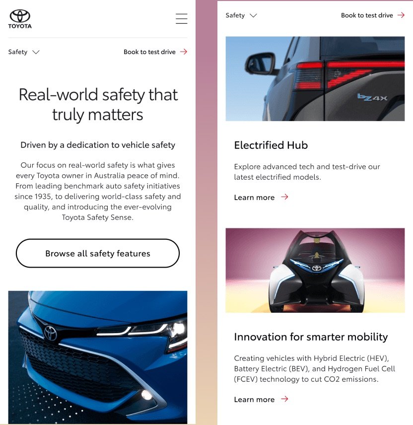
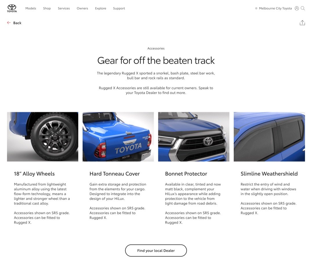
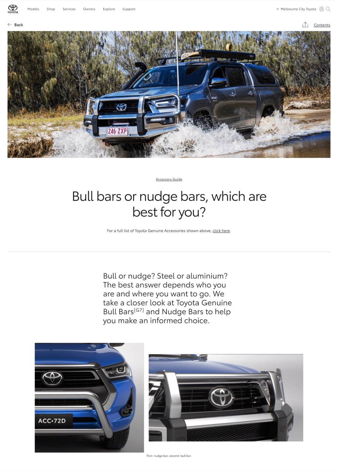
We refined the information architecture to surface only meaningful content, pairing it with relevant, unified imagery that shares the same visual tone and intent.
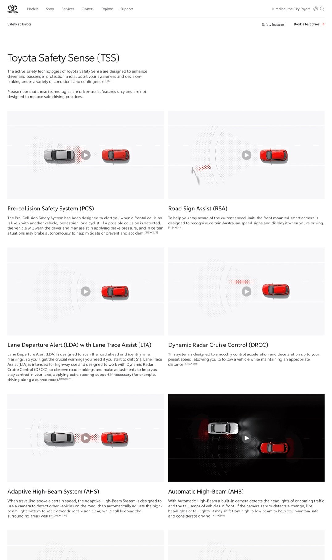
We ensure users can access every piece of information easily, details are available upfront without extra steps, delivering clarity without overwhelming the experience.
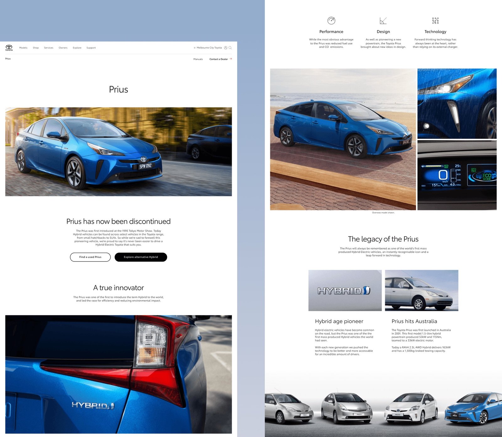
We enhanced all vehicle imagery to ensure both current and legacy models achieve the same level of quality, highlighting design details that inspire and help customers find the vehicle that truly fits them.
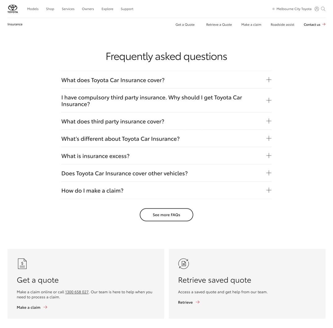
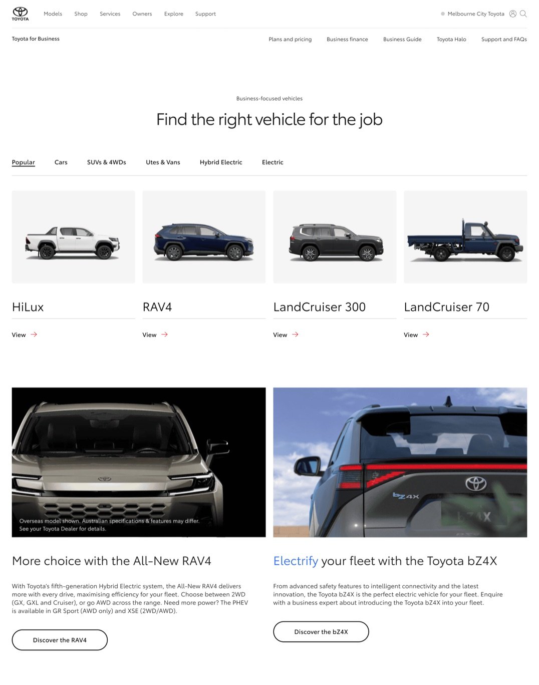
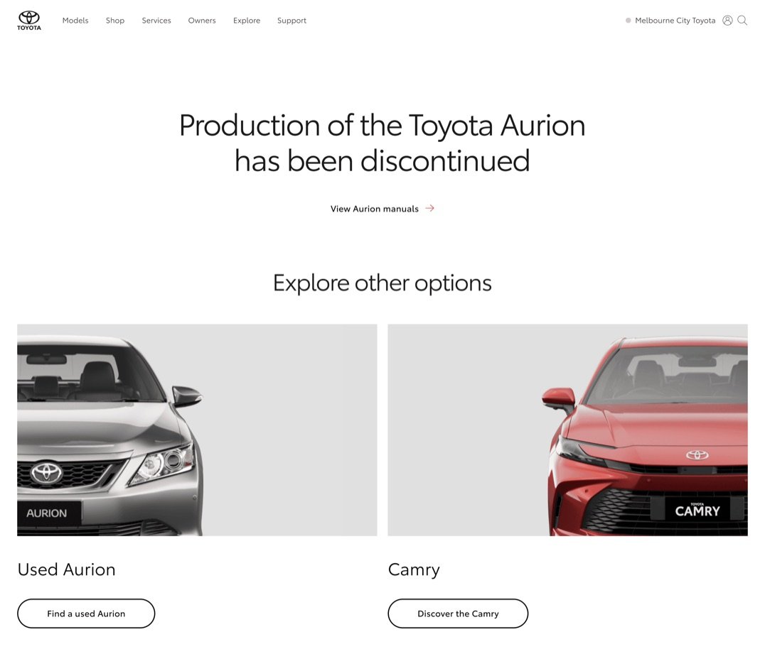
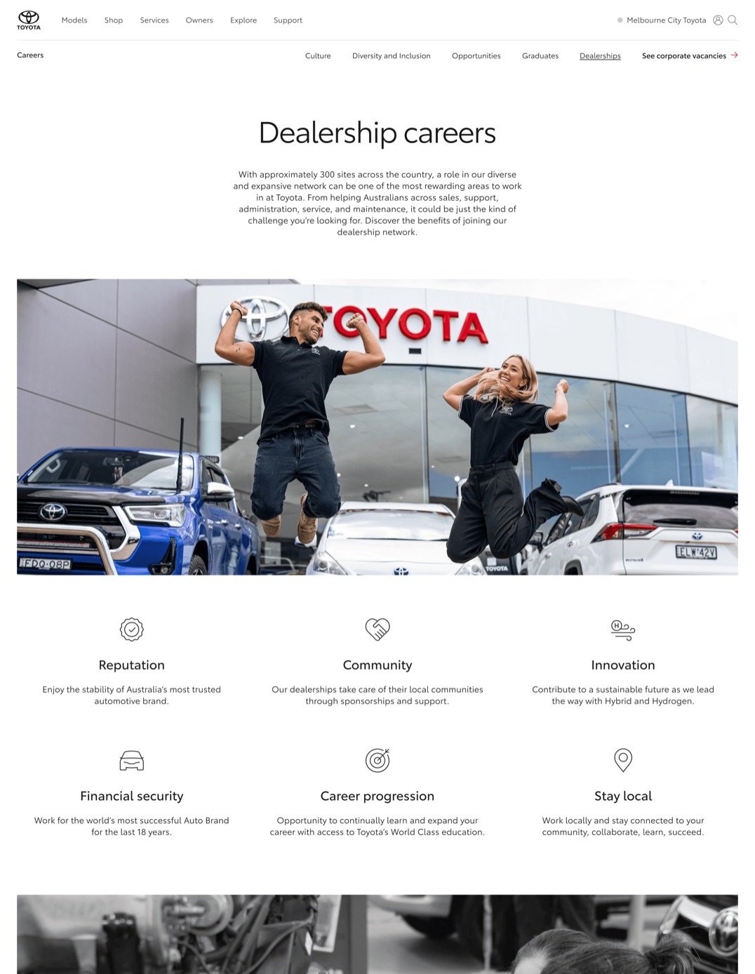
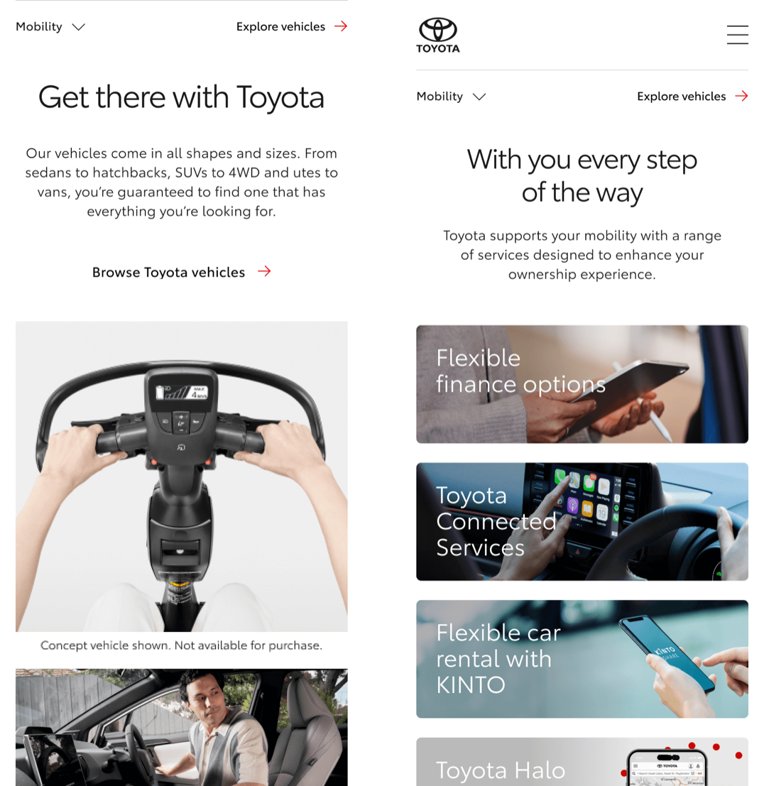
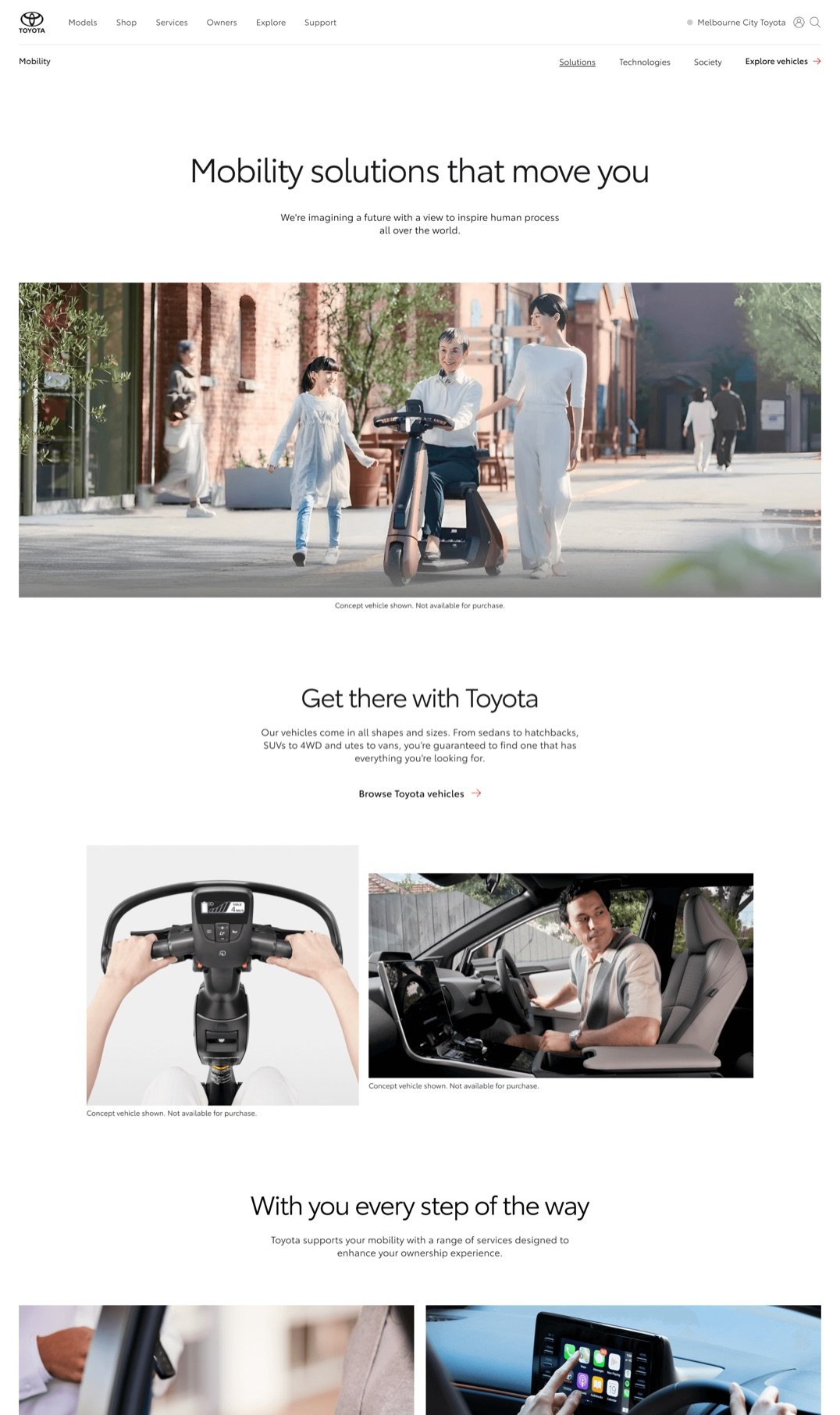
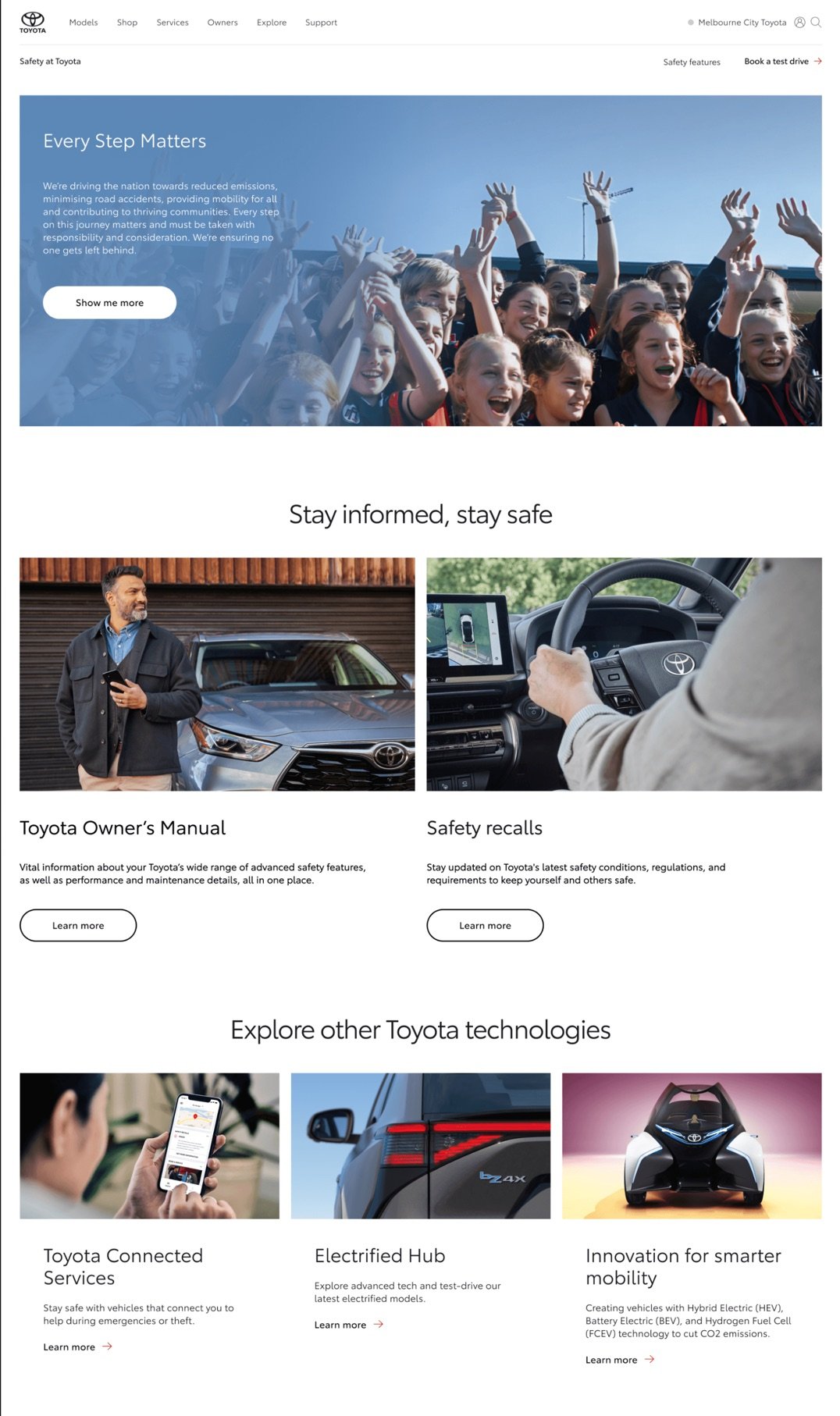
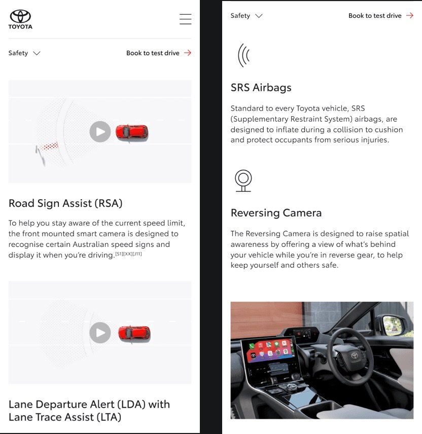
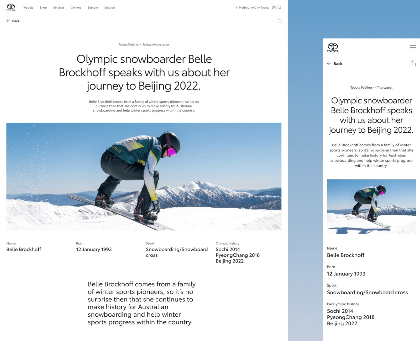
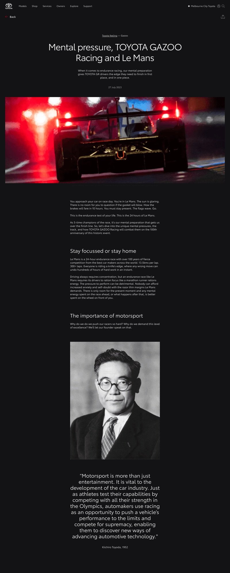
We crafted a seamless cross-device experience using expressive typography sizing and thoughtful layout play. A tightened column width keeps long reads comfortable, focusing attention without unnecessary eye movement.
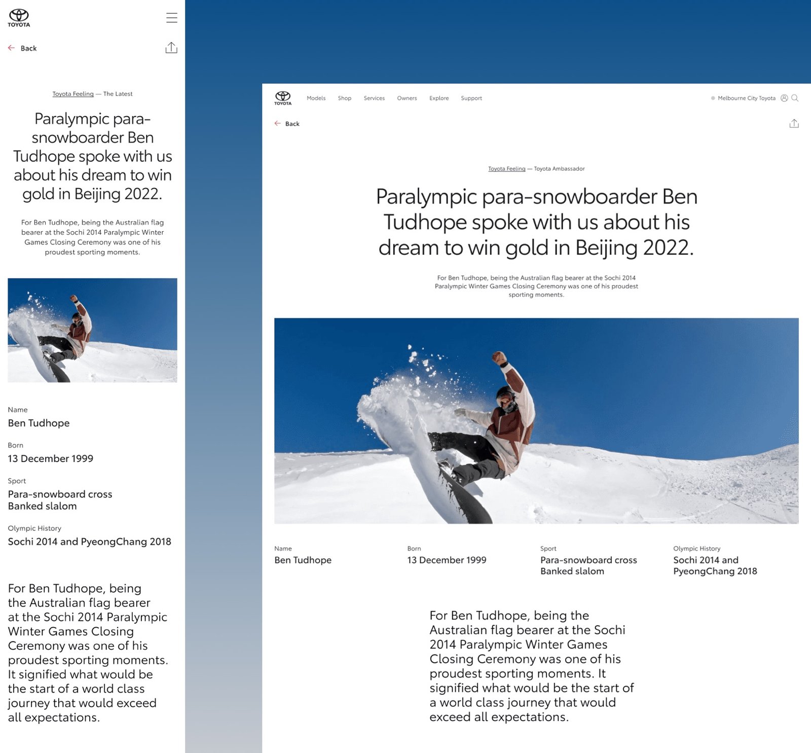
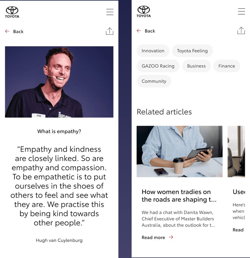
Beyond individual pages, we built a scalable design pattern that uplifts hundreds of diverse article pages. Categories, templates, and reading lists are unified into a consistent, modern editorial system.
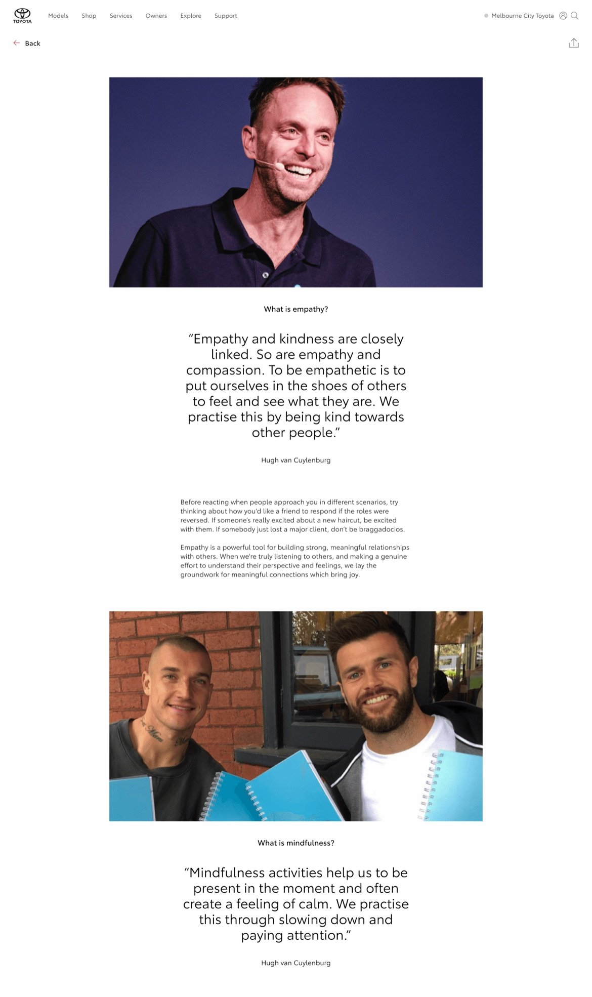
We elevate key quotes and insights to guide users toward what matters most, adding inspiration, rhythm, and visual interest throughout the reading experience.
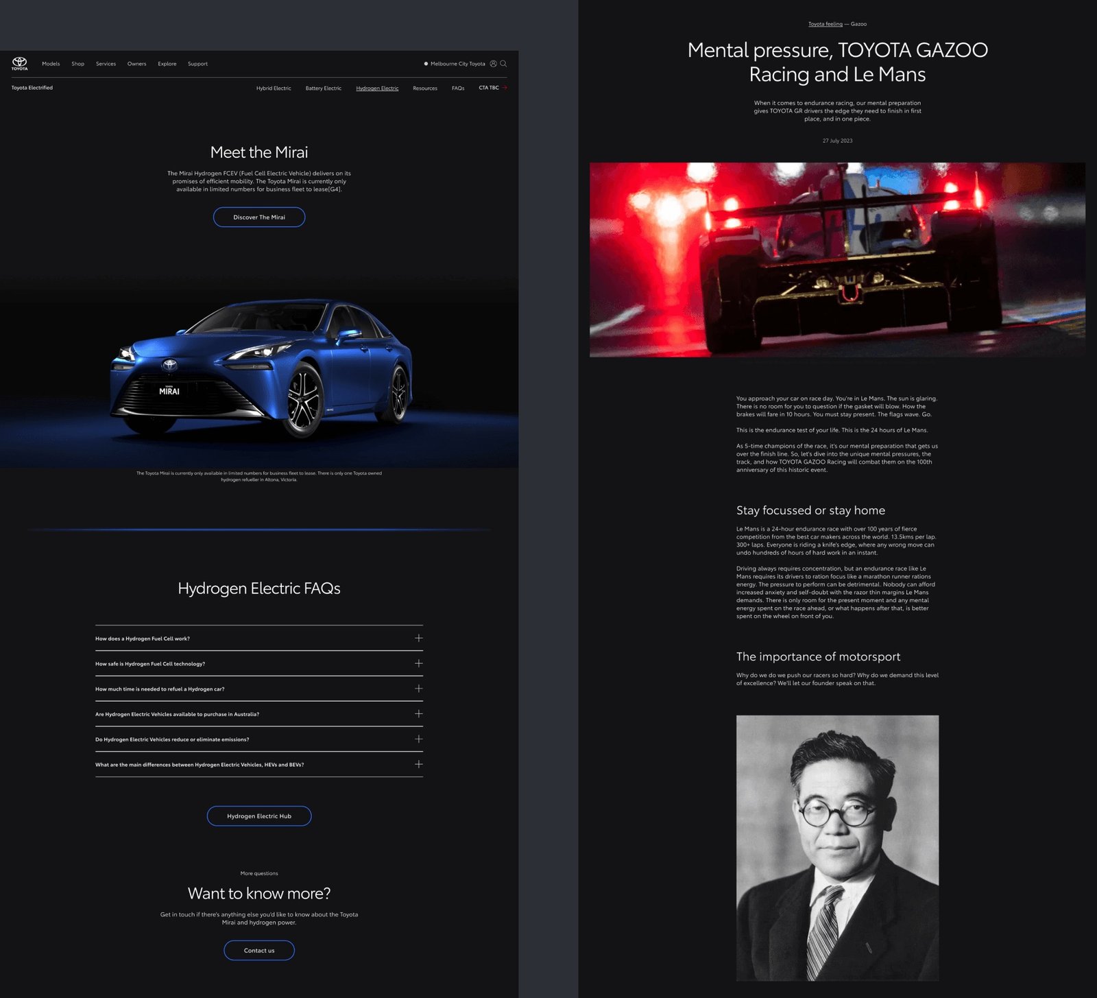
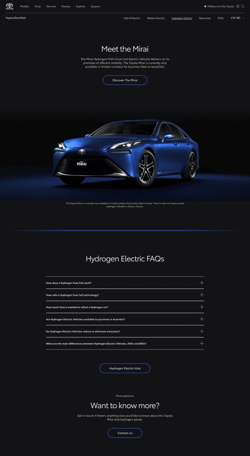
For Electrified and Gazoo Racing, we designed a dedicated dark theme with the same rigor as light mode. Strong contrast, refined readability, and distinct identity colors ensure every product family feels intentional and unmistakably Toyota.
We refined the information architecture to surface only meaningful content, pairing it with relevant, unified imagery that shares the same visual tone and intent.
We ensure users can access every piece of information easily, details are available upfront without extra steps, delivering clarity without overwhelming the experience.
We enhanced all vehicle imagery to ensure both current and legacy models achieve the same level of quality, highlighting design details that inspire and help customers find the vehicle that truly fits them.
We crafted a seamless cross-device experience using expressive typography sizing and thoughtful layout play. A tightened column width keeps long reads comfortable, focusing attention without unnecessary eye movement.
Beyond individual pages, we built a scalable design pattern that uplifts hundreds of diverse article pages. Categories, templates, and reading lists are unified into a consistent, modern editorial system.
We elevate key quotes and insights to guide users toward what matters most, adding inspiration, rhythm, and visual interest throughout the reading experience.
For Electrified and Gazoo Racing, we designed a dedicated dark theme with the same rigor as light mode. Strong contrast, refined readability, and distinct identity colors ensure every product family feels intentional and unmistakably Toyota.
Outcome Highlights
-
536 pages published
Hundreds of pages were refreshed using Toyota’s new design system, creating a cohesive and modern experience across the entire site.
-
Efficient workflow
Example-led guidelines and documentation enabled faster builds and smoother collaboration between designers and content managers.
-
Improved engagement
The modernized interface enhanced usability, strengthened Toyota’s online presence, and improved overall customer perception.
Collaborator
- Visual Designer (Eloyse)
- Experience Designer (Chris R, Ella Chen)
- Producer (Odie, Elle)
- Business Analyst (Devanshi)
- Product Strategist (Angus)
- Content Manager (Stella, Michelle, Keelie, Arfi)
- Dev Team