
Designing the Self Care Library: Faster Discovery, Stronger Habits, and a Unified Experience
The Riliv library is where most users begin their meditation journey, making it central to engagement and retention. But finding the right content wasn’t always easy, users often browsed aimlessly, chose the wrong category, and missed the habit-building benefits of daily meditation.
Our goal was to make the library smarter, quicker to explore, and inviting enough to keep people coming back regularly. We also aimed to connect it seamlessly with new features like Journal, creating a unified self-care experience.

Disclaimer: This is a high-level project overview. For the full case study or more details, feel free to reach out at olehabib98@gmail.com.
Key Challenges
Improving a content library isn’t just about adding more content, it’s about making every visit meaningful. We needed to remove friction, surface the right categories instantly, and give users reasons to return daily, all while unifying the design for future scalability.
- 01
How can we create the best experience for finding meditation content that truly matches user needs?
- 02
How can we encourage users to return and continue meditation as a daily habit?
- 03
How can we scale and unify the library to include features like and Journal in a cohesive way?
Design Process
- 01RICE prioritization to choose high-impact improvements
- 02Made design A and B from initial ideas
- 03A/B Usability testing for qualitative insights
- 04Data analysis to find retention drivers
- 05Refined design using insights from testing and data
- 06Add Journal to the library
- 07Visual and structural adjustments for scalability
- 08Final usability testing for validation
Key strategy
We focused on helping users find the right content instantly, delivering value from the first interaction, and creating habit loops that keep them coming back, putting satisfaction before metrics.
Key Solutions
- 01
Rename for relevance
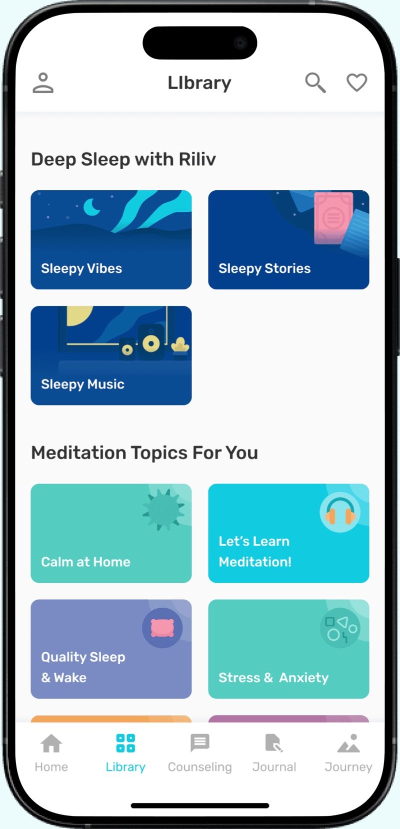
We killed the generic “Library” label or no more relevant “Meditation” label. It’s now Self Care, housing Meditation, Lelap, Journey, and Journal. A name that actually says what it does.
- 02
Smarter category cards
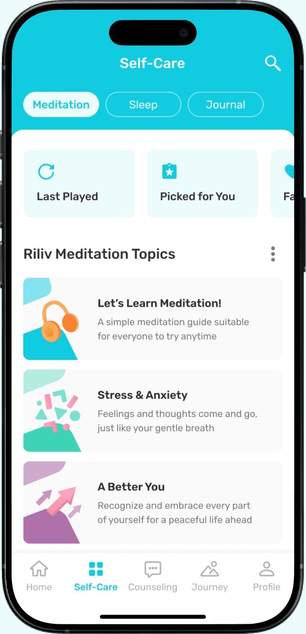
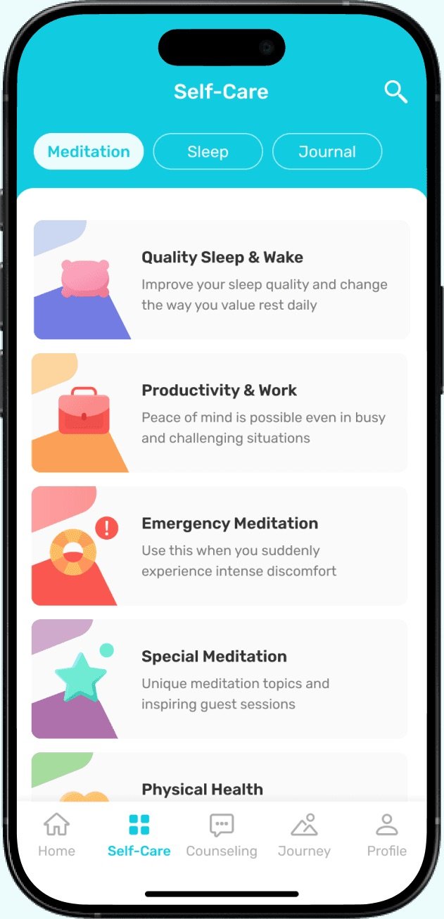
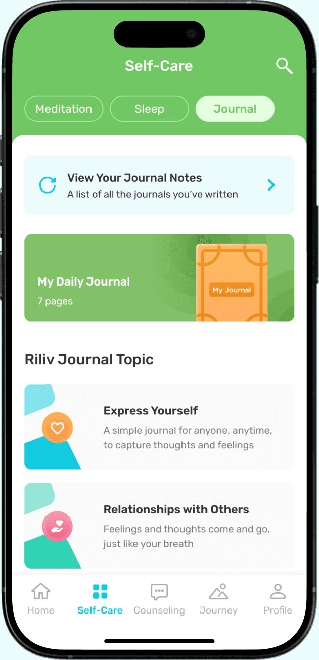
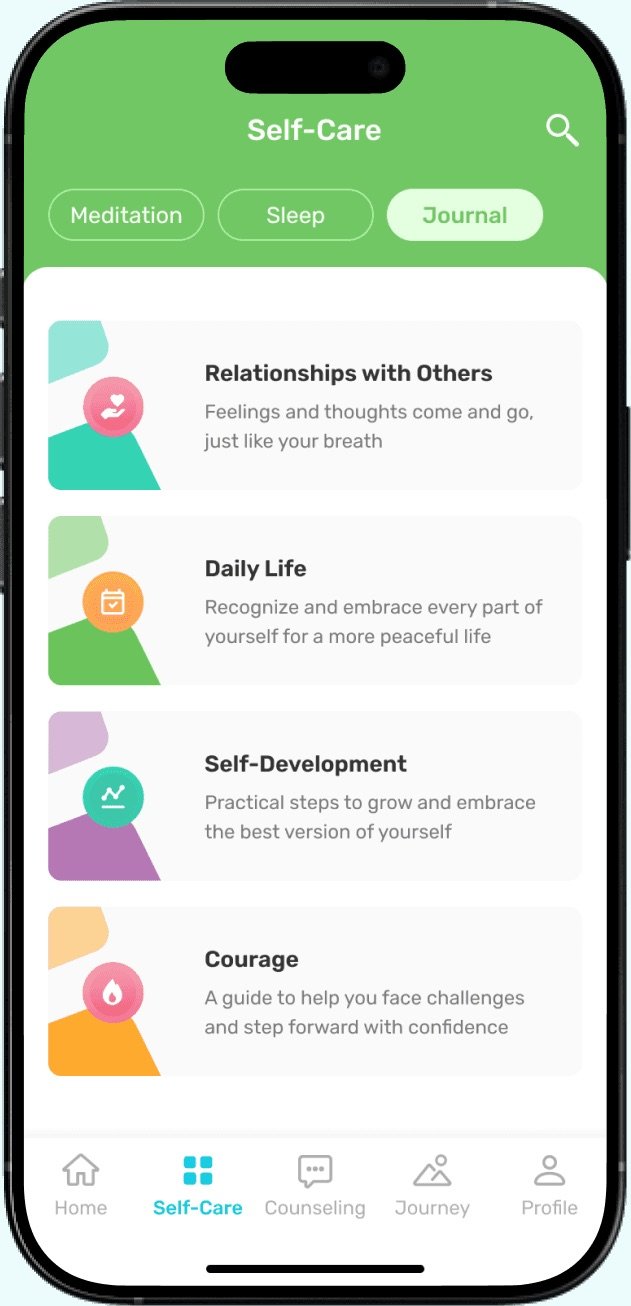
Wide cards with category name + short overview. No need to show all contents in the carousel like Design B, but also no more blind clicking like Design A. Users know what’s inside before they tap, which means better matches and longer engagement.
- 03
Curated order informed by user trends
The sequence of category cards is carefully curated using aggregated play data from the most popular categories across the platform. This ensures the library opens with content that has the highest relevance and engagement potential for the majority of users.
- 04
Tabs over endless scrolling
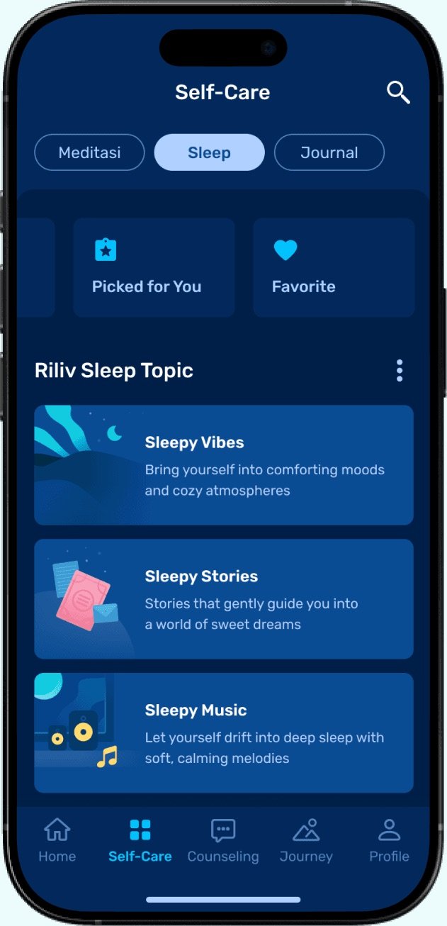
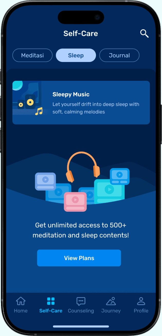
We replaced the endless vertical scroll with a tab layout, one tab for each feature. This makes navigation more intentional, allows users to focus on one type of content at a time, and helps them understand the full scope of Self Care at a glance.
- 05
Identity-preserving visuals
Each feature keeps its own color theme, applied to the tab headers, while the cards remain subtle in grey to blend with the background. An illustration on the left side carries the feature’s identity, creating an engaging look without overwhelming the user.
- 06
Data-backed habit hooks
We placed Recent and Recommendation cards at the top of the Meditation tab, chosen based on engagement data from the Home page, where they had the highest clicks and strong retention metrics. This encourages users to pick up where they left off or explore curated suggestions that fit their preferences.

Outcome Highlights
-
Faster content discovery
Clear structure, tabs, and curated category order helped users find preferred content faster, leading to quicker starts and higher engagement.
-
Higher retention triggers
Recent and recommended cards drove repeat sessions and helped users continue ongoing series without friction.
-
Unified & scalable
The Self Care library now supports Meditation, Lelap, and Journal, and can scale to future content without redesign.
-
Stronger brand cohesion
Consistent visuals and color-coded tabs improved brand perception and made the library feel more premium.
Collaborator
- Product Manager (Novia)
- Psychology Specialist (Geby)
- CBO (Audy)
- Tech Team