
Evolving a More Mature Mascot and Applying It to Dozens of App Thumbnails to Strengthen Brand Identity
Riliv had an existing mascot and illustration system I created, known as Illustration 1.0. It unified inconsistent visuals into a coherent character style and gave the brand its first identity foundation.
But as Riliv shifted toward a more mature audience and began exploring B2B opportunities, the child-like mascot no longer matched the brand’s direction. While real images became more common for professional touchpoints, illustrations remained vital for B2C in-app experiences.

Disclaimer: This is a high-level project overview. For the full case study or more details, feel free to reach out at olehabib98@gmail.com.
Key Challenges
The existing mascot looked too child-like (small body, playful proportions), misaligned with a more mature audience and B2B positioning.
- 01
How can we evolve the mascot to appear professional yet approachable, balancing B2B credibility and B2C friendliness?
- 02
How do we integrate the new style into dozens of existing thumbnails and in-app assets without disrupting continuity?
- 03
How can we build a mascot system that is scalable and reusable, reducing design overhead in the future?
Key strategy
Evolve, don’t replace. I built a modular mascot system—professional in style, diverse in character, and flexible enough to serve both business and consumer needs.
Key Solutions
- 01
Mature Mascot Redesign
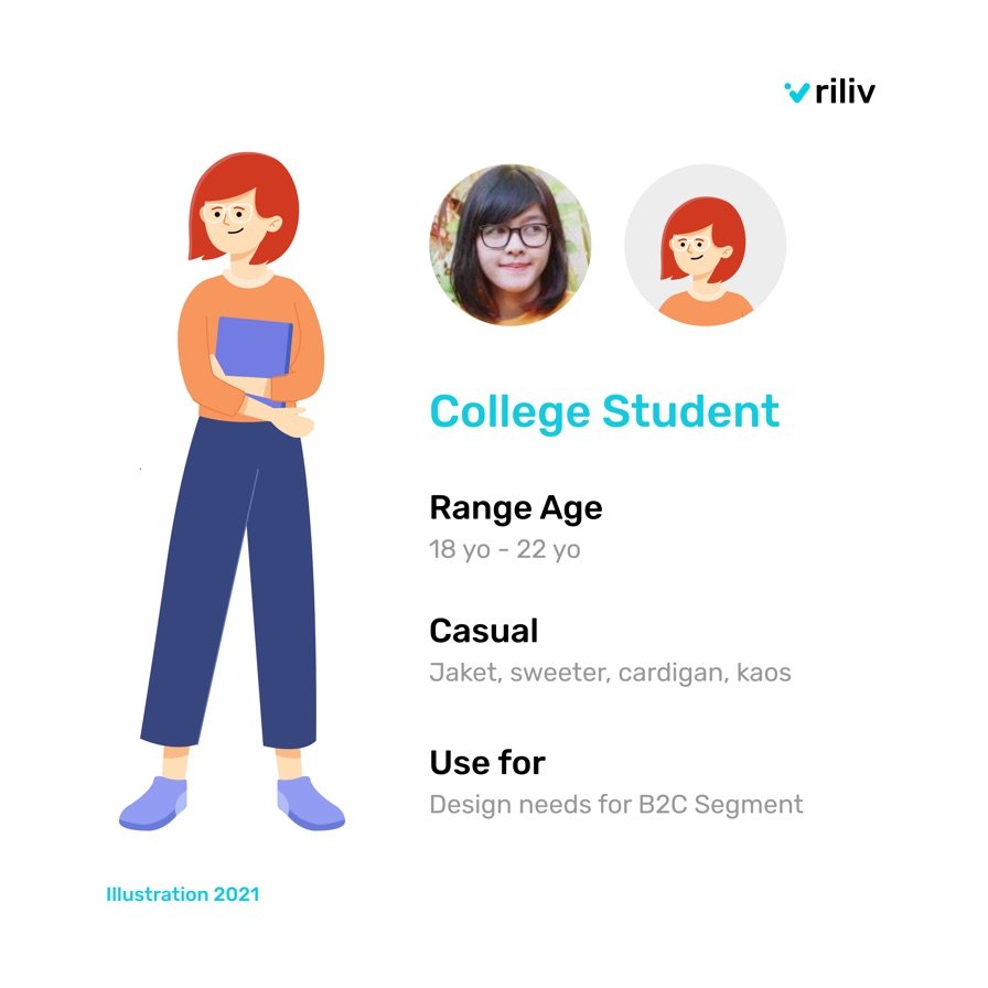
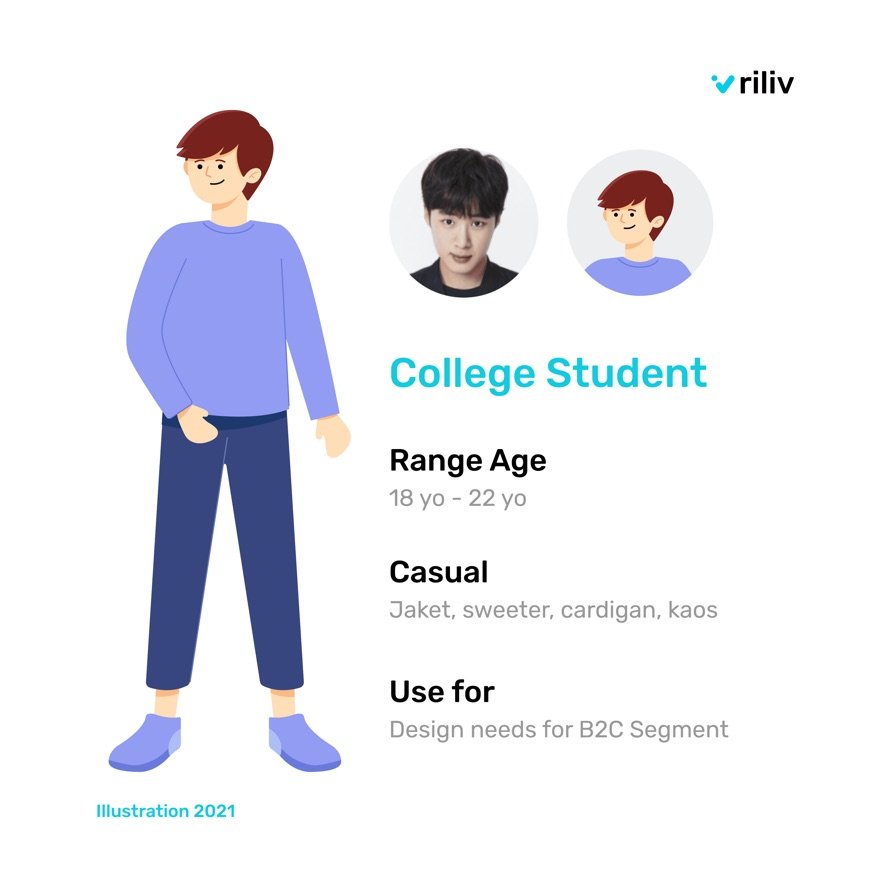
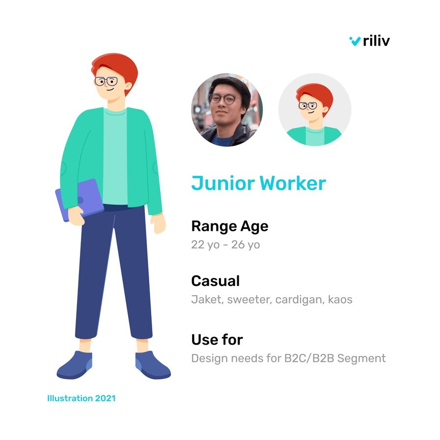
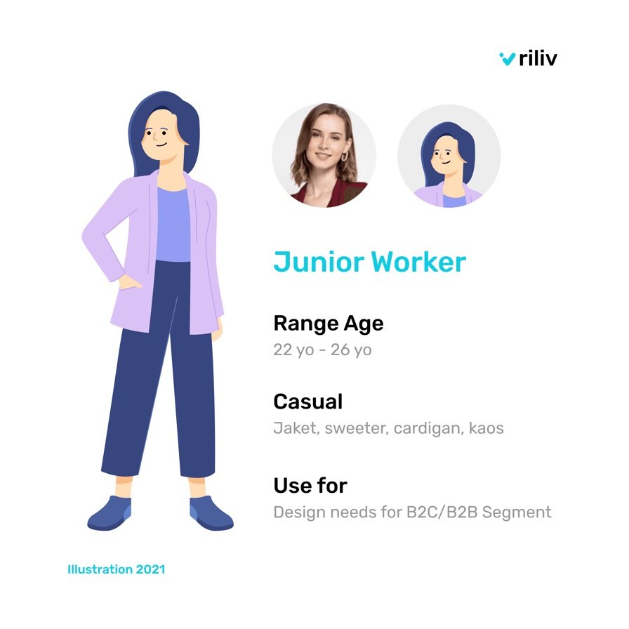
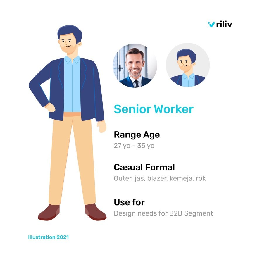
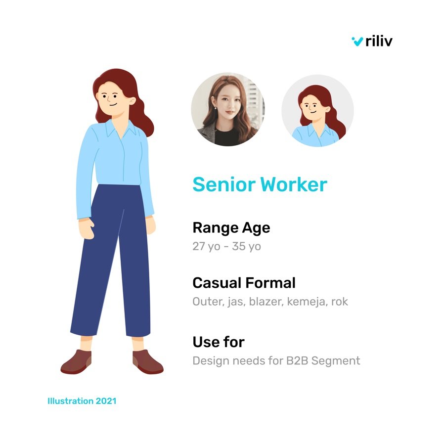
Reimagined the mascot with taller proportions and refined features to match the scale of mature users, avoiding the child-like look while retaining warmth.
- 02
Illustration 2.0 Library
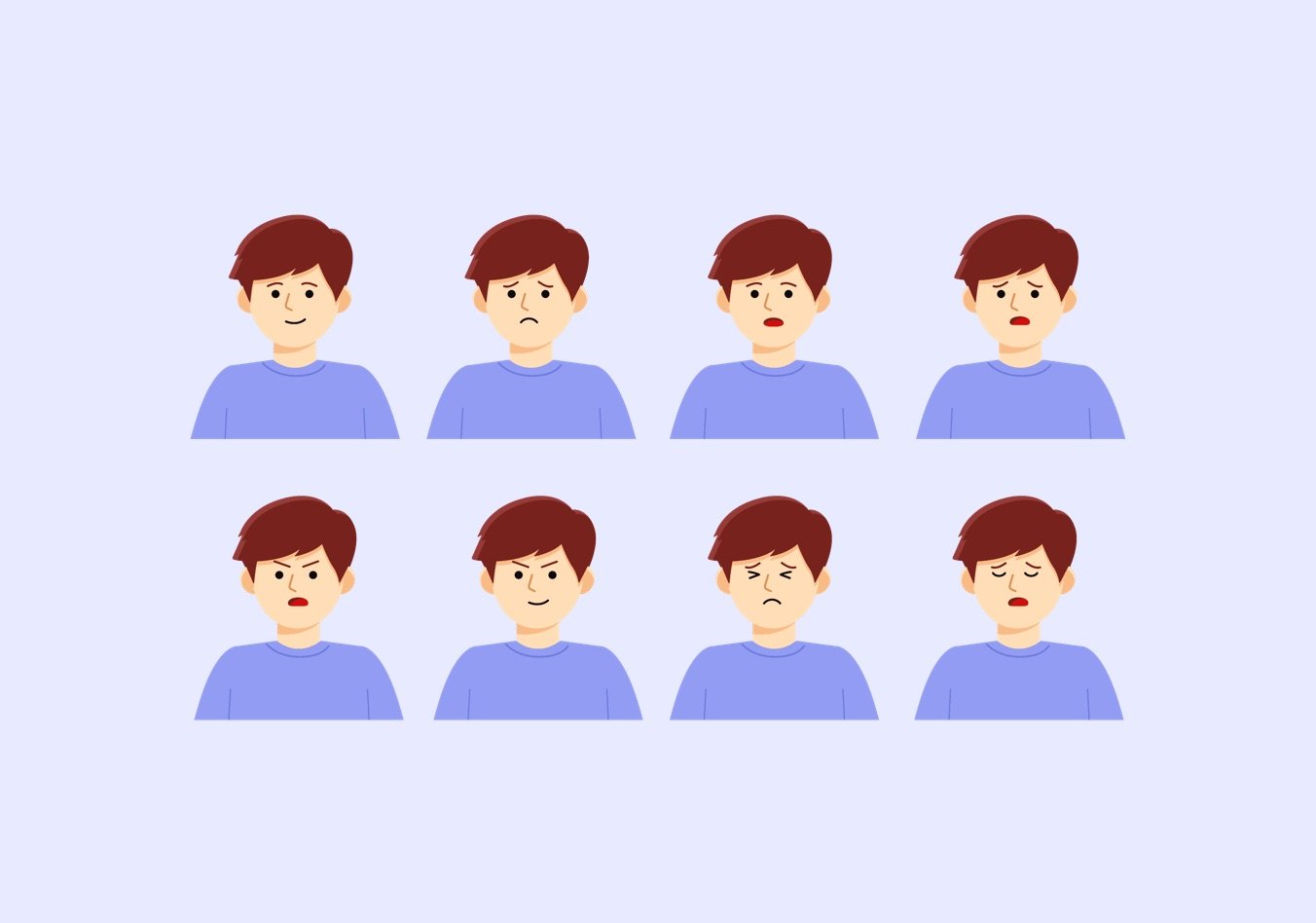
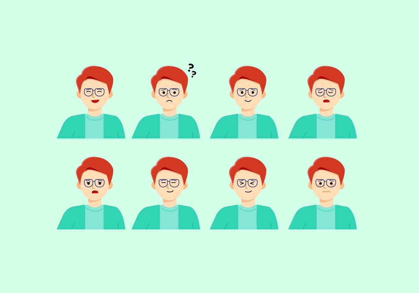
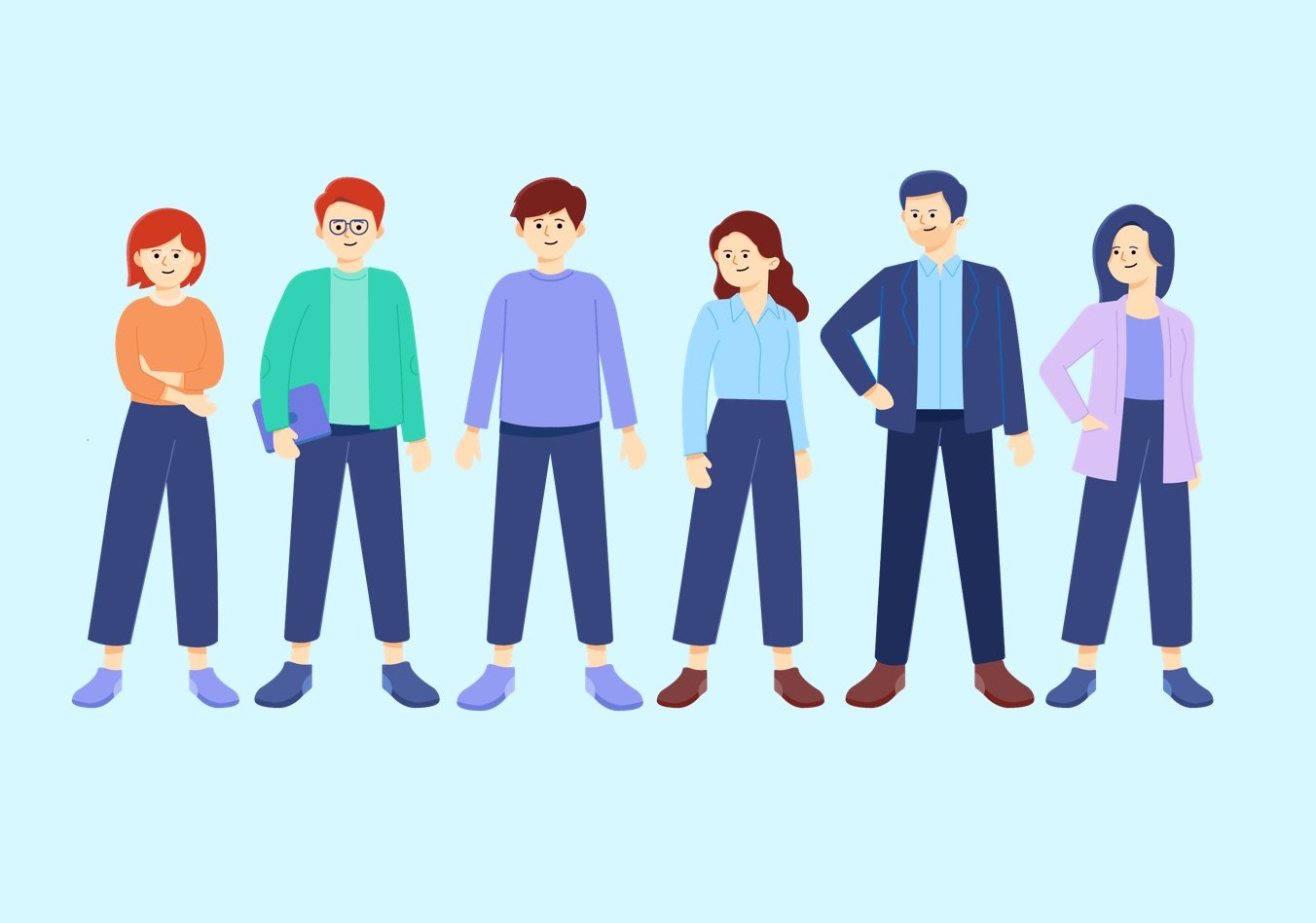
Designed six mascot archetypes plus a wide range of poses and illustration sets. Once new poses are created, they can be easily slotted into the system, enabling quick scaling.
- 03
Balanced Visual Language
Refined color palette, subtler expressions, and consistent styling to feel professional for B2B, but still engaging for B2C audiences.
- 04
Gradual Rollout
Rolled out Illustration 2.0 in high-visibility areas first (app thumbnails, in-app flows) to ease adoption without confusing users.
Concept of Mascot
I created six mascot figures representing different ages and backgrounds, designed to feel relatable in various user contexts. Each character was built using real human references to ensure authenticity and stronger user connection.
Pose System
Each mascot comes with a library of facial and body poses that can be mixed and matched. This modular approach allows quick creation of new illustrations without starting from scratch—ensuring efficiency, consistency, and scalability.

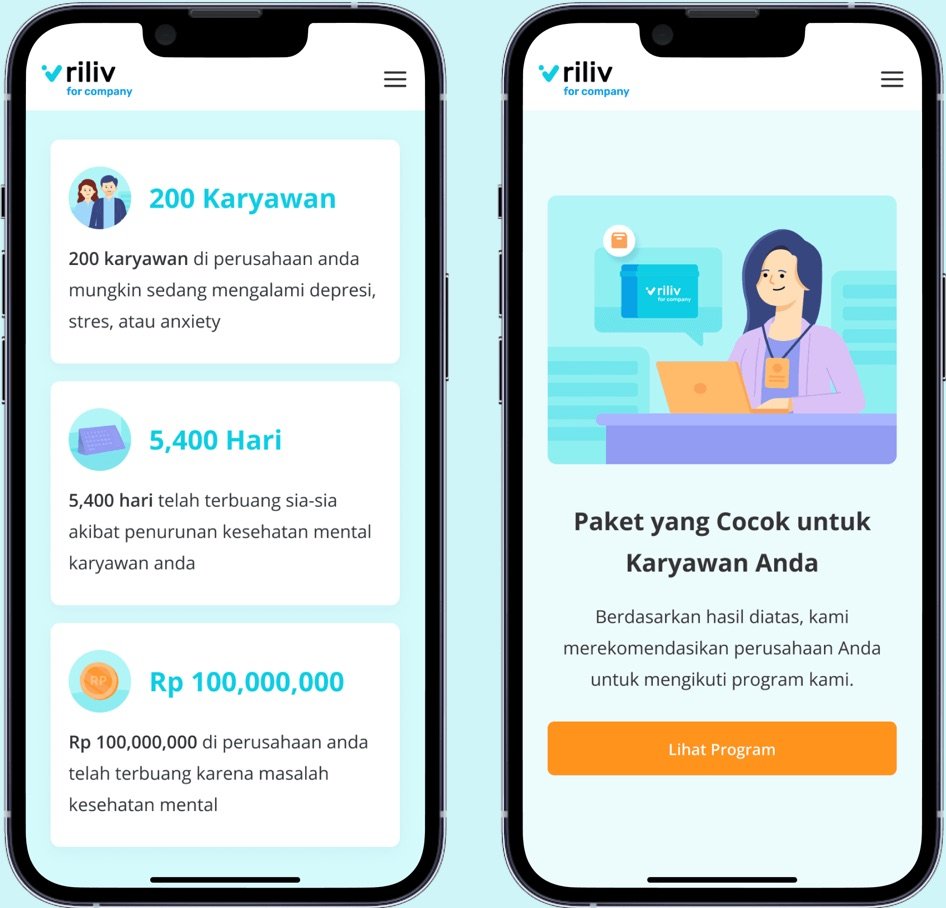
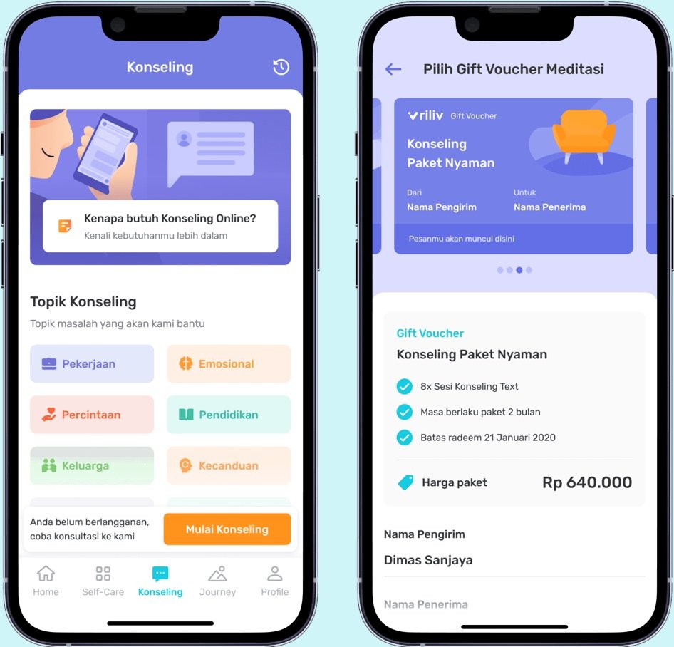
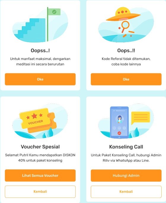
In-App Implementation
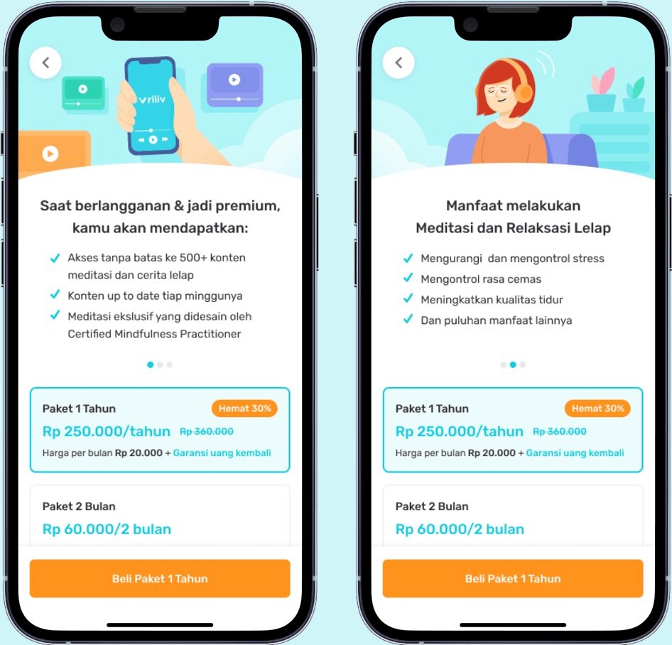
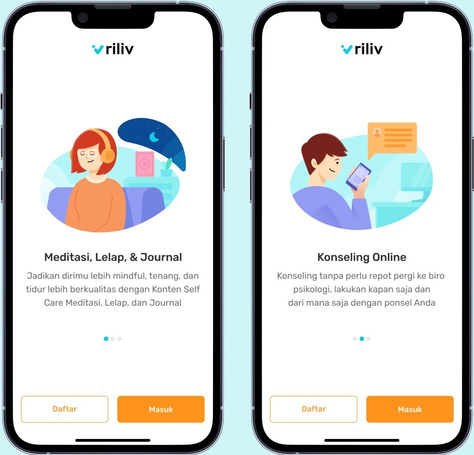
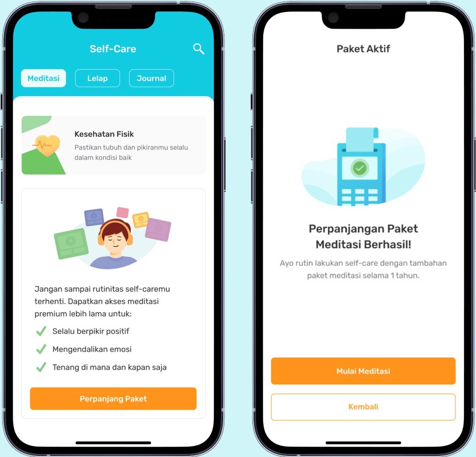
Illustrations were applied across headers, empty states, and modal dialogs. The rollout was gradual: some areas adopted the new mascots, while others used object-only illustrations. All followed the updated style guide to maintain consistency.
Thumbnails
Dozens of audio content thumbnails were redesigned with the new style. While some older thumbnails still used the previous mascot during transition, I documented and handed over a full update list to the graphic design team. All Illustration 2.0 assets were created by me.


Outcome Highlights
-
Stronger brand alignment
The mascot now resonates with a mature audience and supports B2B branding, while staying warm and friendly for B2C users.
-
Reusable illustration library
A system of poses and archetypes that speeds up production, reduces design debt, and makes it easy for other designers to apply.
-
Future-proof foundation
A scalable mascot system that grows with Riliv’s dual needs: professional for business clients, approachable for everyday users.