
Redesigning Onboarding Process: Increasing Adoption Rate by 36% in the Riliv Mobile App
Riliv is a mental wellness app offering meditation and counseling services. However, its onboarding flow caused a high user drop-off, particularly at steps that felt irrelevant, long, or intrusive. After identifying friction points through analytics and usability testing, we overhauled the experience to be faster, more personalized, and trust-building.
We turned a clunky first impression into a seamless entry point that significantly boosted adoption.

Disclaimer: This is a high-level project overview. For the full case study or more details, feel free to reach out at olehabib98@gmail.com.
Key Challenges
Riliv aimed to make mental wellness accessible, but users were dropping off before even getting started.
- 01
How can we create a personalized experience that supports different user goals—meditation or counseling?
- 02
How can we streamline onboarding without sacrificing clarity or trust?
- 03
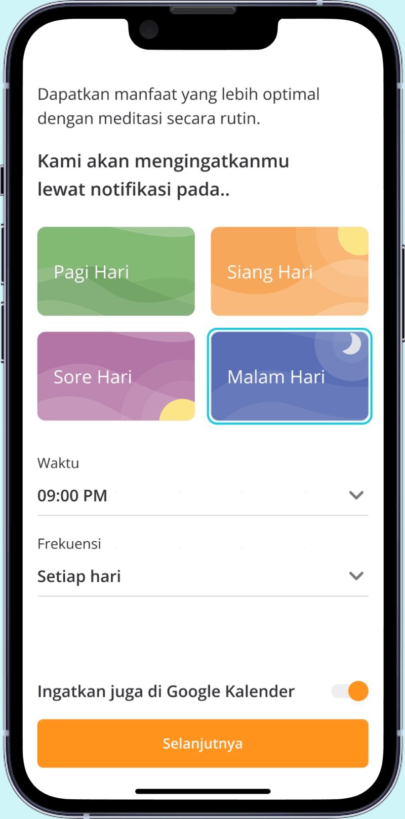
How can we shift valuable steps like reminders earlier, increasing engagement without pushback?
Design Process
- 01Analyze Data Funnel
- 02Validate Issues via Usability Testing
- 03Map Multi-Path User Flows
- 04Build UI and Interactive Prototypes
- 05Conduct Usability Testing
- 06Revise and Finalize design
- 07Support QA and launch
Key strategy
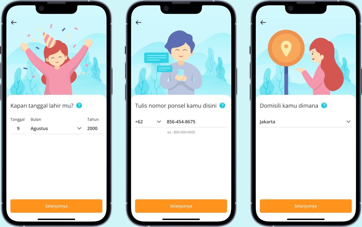
We designed the onboarding to feel like a conversation, not a checklist—intelligently adapting to each user’s goals, emotional state, and readiness level to build trust and guide them with purpose.
Key Solutions
- 01
Personalized User Flow
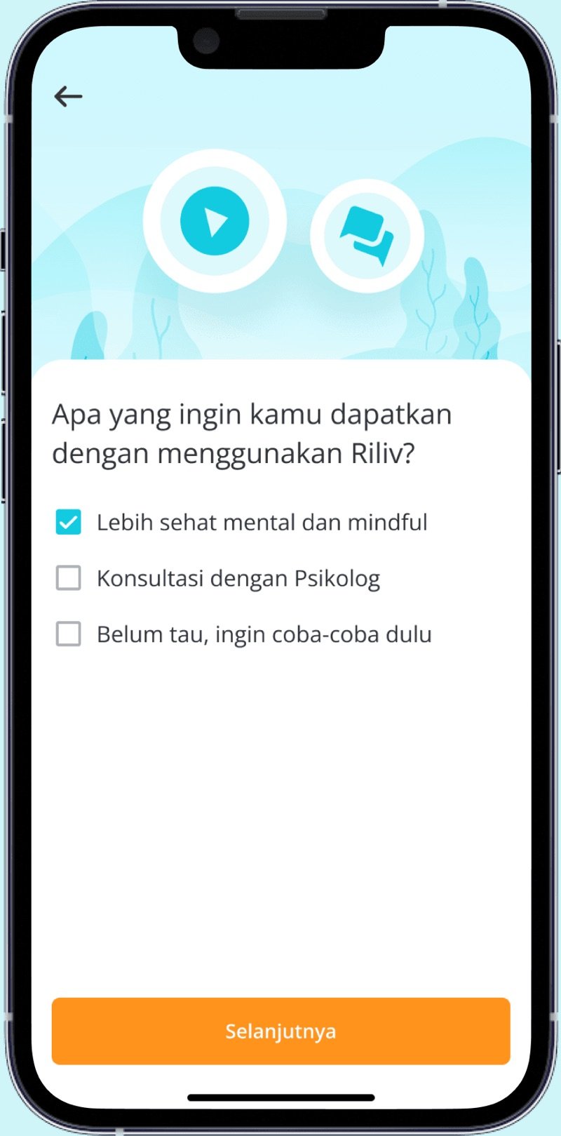
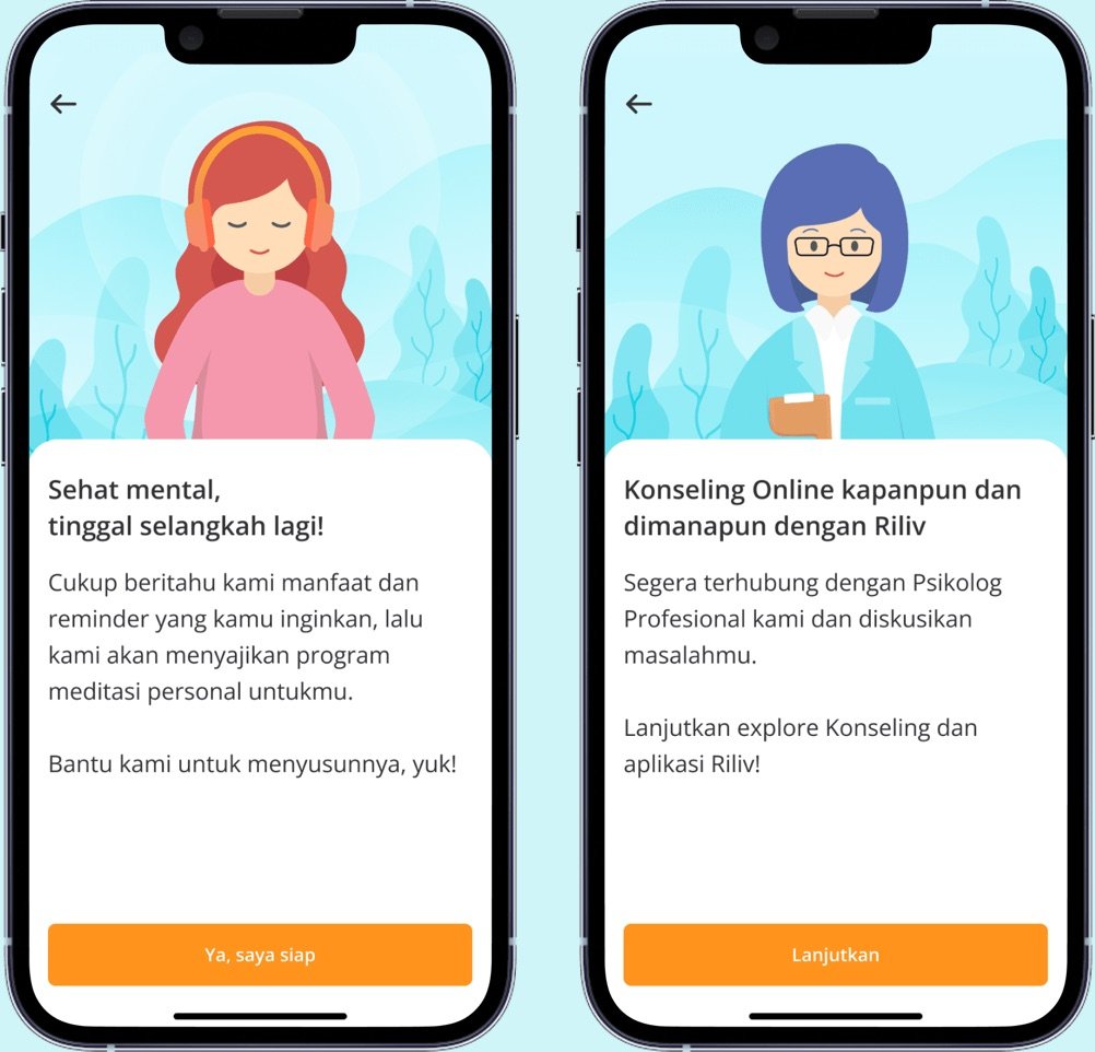
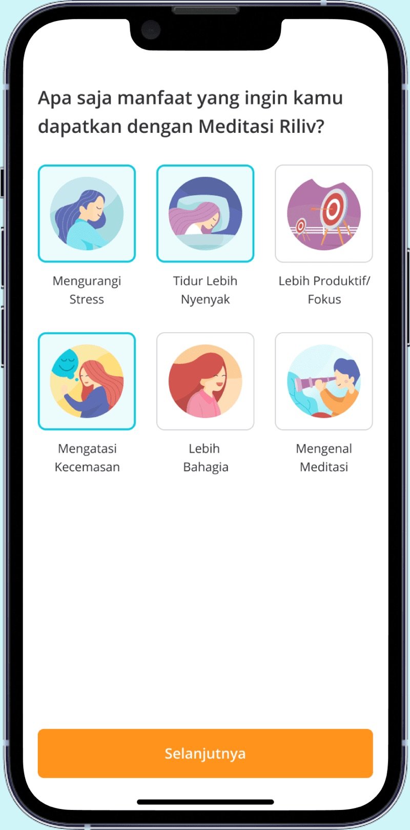
Created three distinct onboarding paths based on intent: mindfulness, counseling, or unsure. Each path had tailored steps, visuals, and tone to make users feel understood from the start.
- 02
Simplified Progression
Removed unnecessary friction by reducing the number of screens, adding skip options, and giving users more control over their pace.
- 03
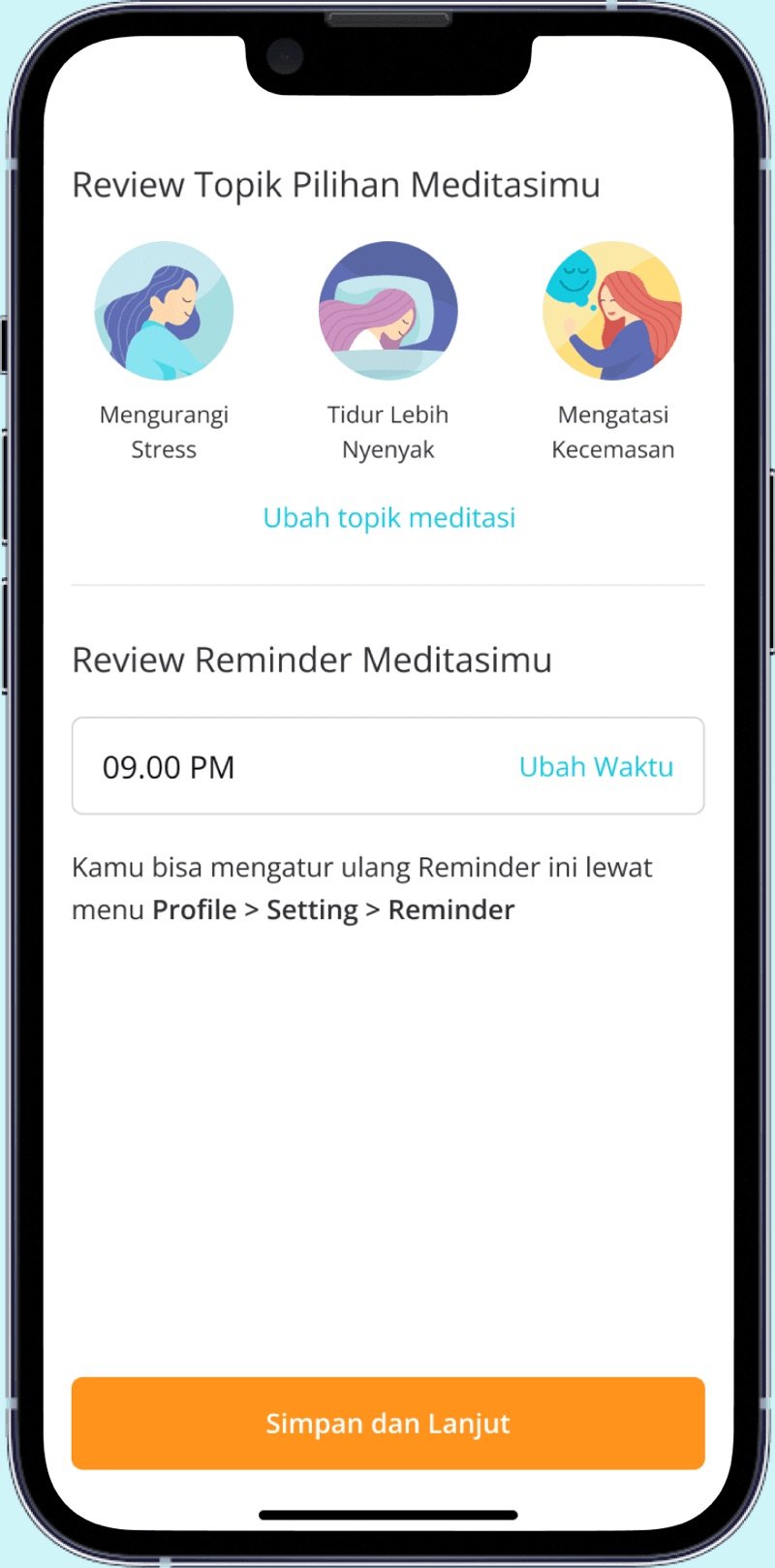
Early Reminder Placement
Moved the reminder feature earlier in the flow to increase visibility and adoption. Users could choose reminder frequency and integrate with Google Calendar.
- 04
Flexible Meditation Experience
Previously, users were forced to play a meditation track. The redesign allowed them to skip, making the experience feel less forced and more respectful of time.
- 05
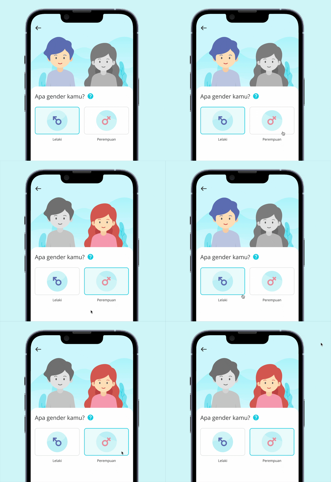
Gender-Matched Illustrations & Consistent Visual Style
Aligned all illustrations to a cohesive visual language, and used gender-aware imagery to strengthen personal resonance and inclusivity.

Outcome Highlights
Based on 2020 data
-
Adoption
93.3% of users completed onboarding — a +36% increase from the original flow, showing that friction points were effectively resolved.
-
Retention Lift
Push reminder was perceived positively. While exact impact on retention isn’t fully trackable, early data showed increased re-engagement patterns.
-
Clarity & Trust
Users felt more confident navigating the app and understood Riliv’s value faster — laying the foundation for sustained use.
Collaborator
- Product Manager (Novia)
- Psychology Specialist (Geby)
- CBO (Audy)
- Tech Team